Interstellar Times: Artemis II
Objective
Select a social, cultural, or political event and design a news webpage dedicated to that event featuring a range of different articles on the issue. Ensure that the webpage has a branded feel with a logo and color palette.
Tools
Sublime Text Photoshop Illustrator
Skills
HTML & CSS Photo Editing Branding
Role
Web Design UI/UX Research UI/UX Web Developer
Overview
Interstellar Times is a science and technology centered newspaper bringing you the latest news in space exploration. From breakthrough discoveries to new technologies, Interstellar Times breaks down complex ideas through storytelling and visual design. Subscribe and follow along for content at the intersection of science, technology, and discovery.
Goal
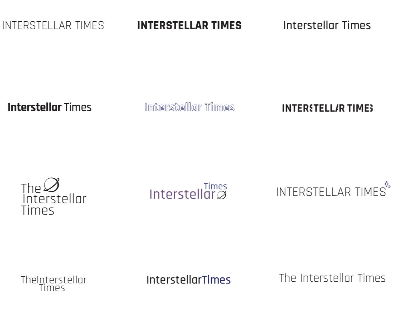
Design and code a branded news webpage dedicated to space exploration featuring a range of articles. Through a custom logo, color, and thoughtful layout system, Interstellar Times aims to create
a cohesive visual identity with clear hierarchy, engaging aesthetic standards, and narrative consistency across the page.
Audience
The targeted users for this webpage are young teens to middle aged and older adults, in addition to those who are interested in news articles about space exploration and science.
The average age of a mainstream digital newspaper subscriber is in their mid to late 40s. Individuals within this age range spend significantly less time on social media compared to teens and those in their early twenties. This group of targeted users often get their news reports from digital newspapers. A majority of teens and young adults on social media will likely find news articles linked to the posts regarding news on the Artemis II space mission. Interacting with those posts will direct them to this webpage where they can learn more.
Challenge
Since this webpage was designed with both young and older individuals in mind, accounting for both age groups is essential. Older folks are heavily reliant on the news sources being reliable and trustworthy, while ensuring that the page is easy to navigate. Younger users are more concerned about what they can get out of the experience, and so the design needs to reflect the social media platform experience that they are familiar with.
Concept & Strategy
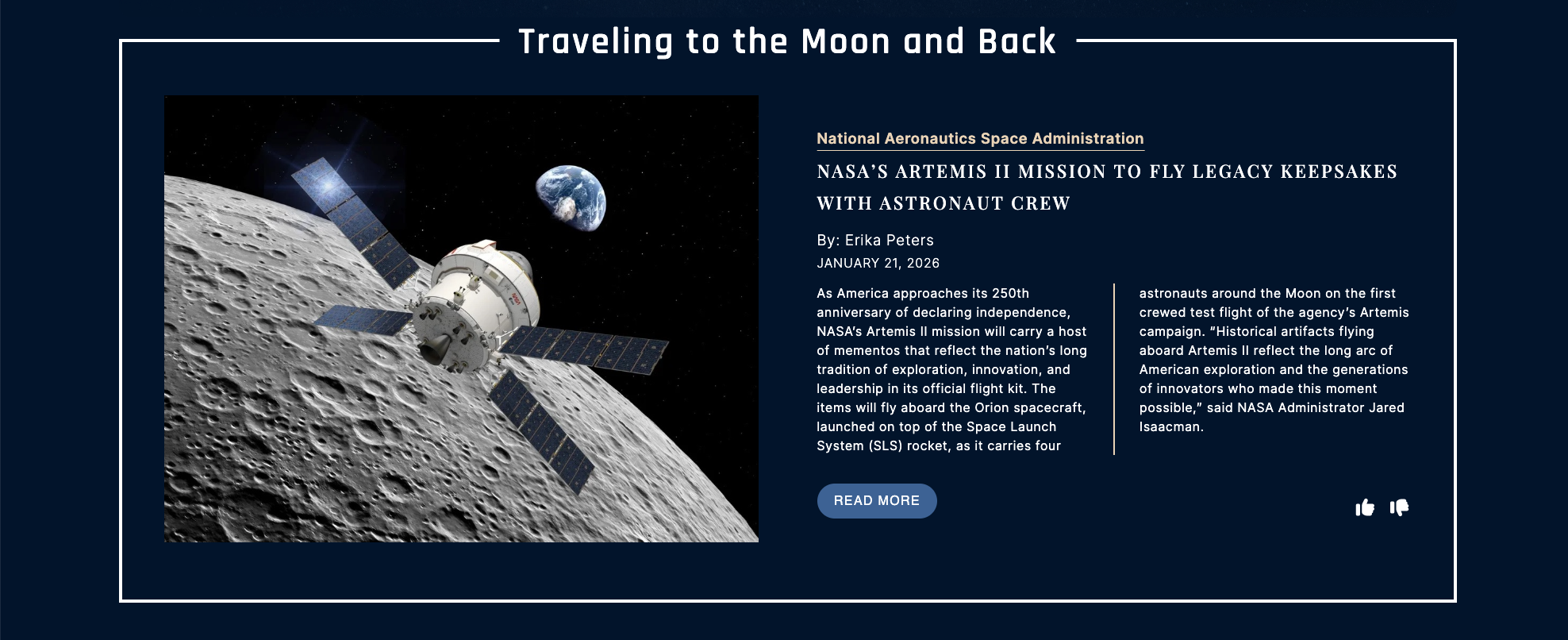
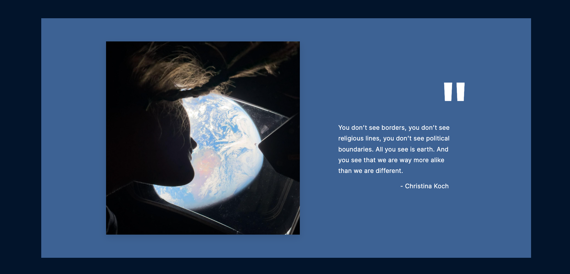
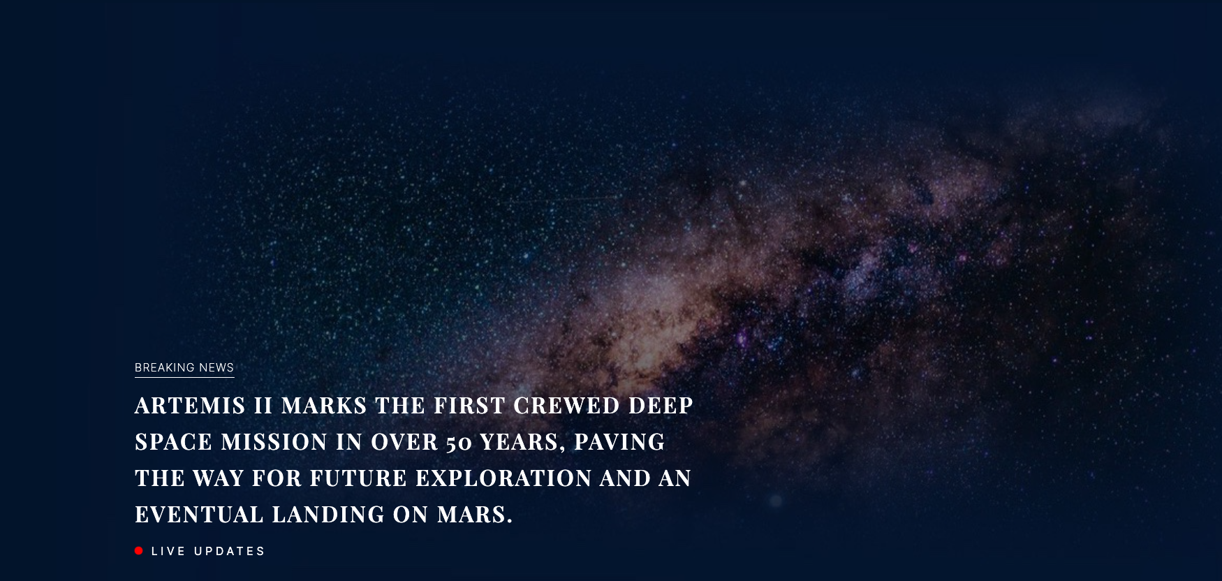
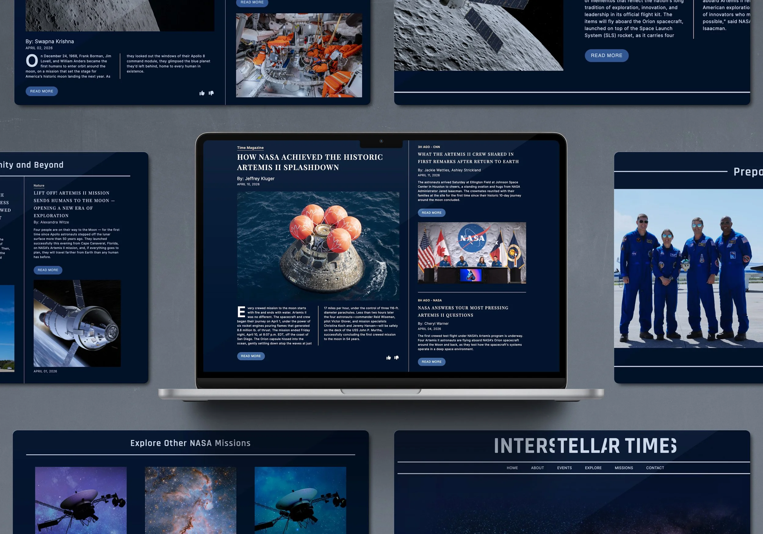
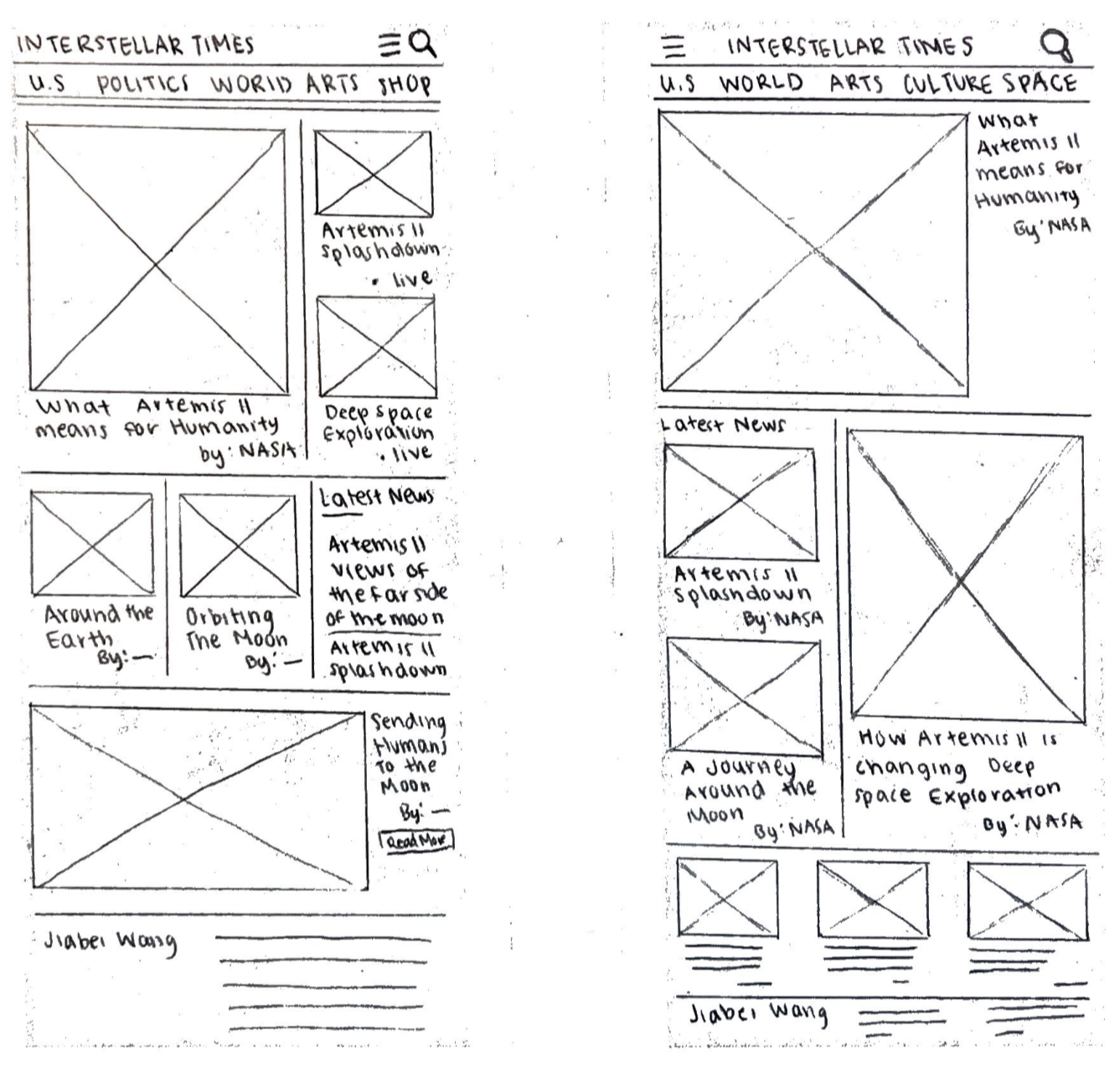
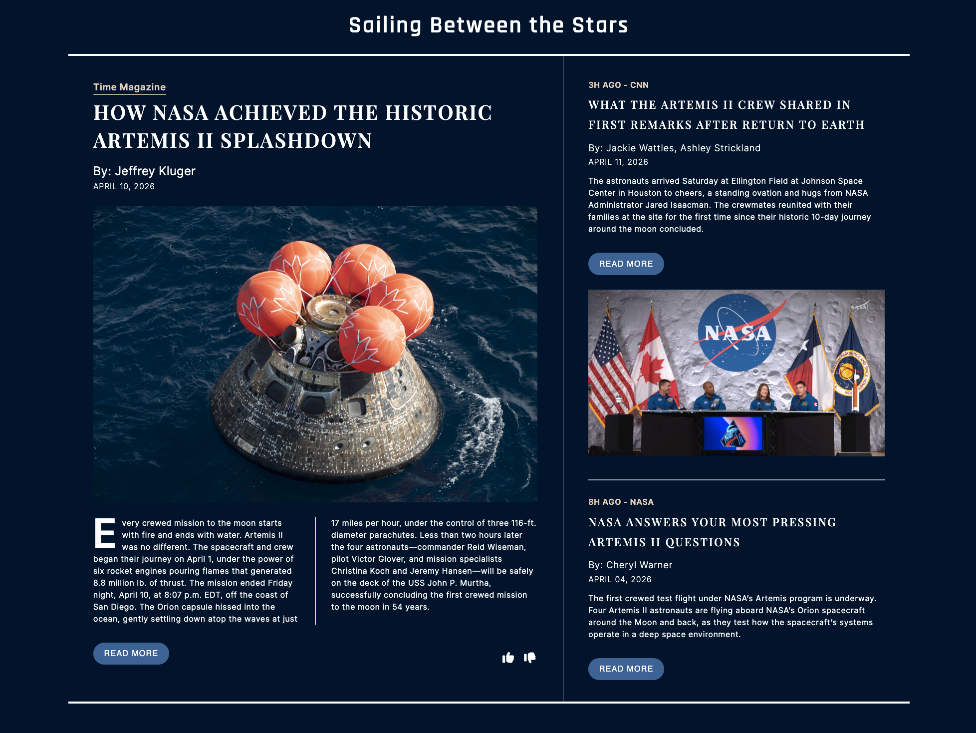
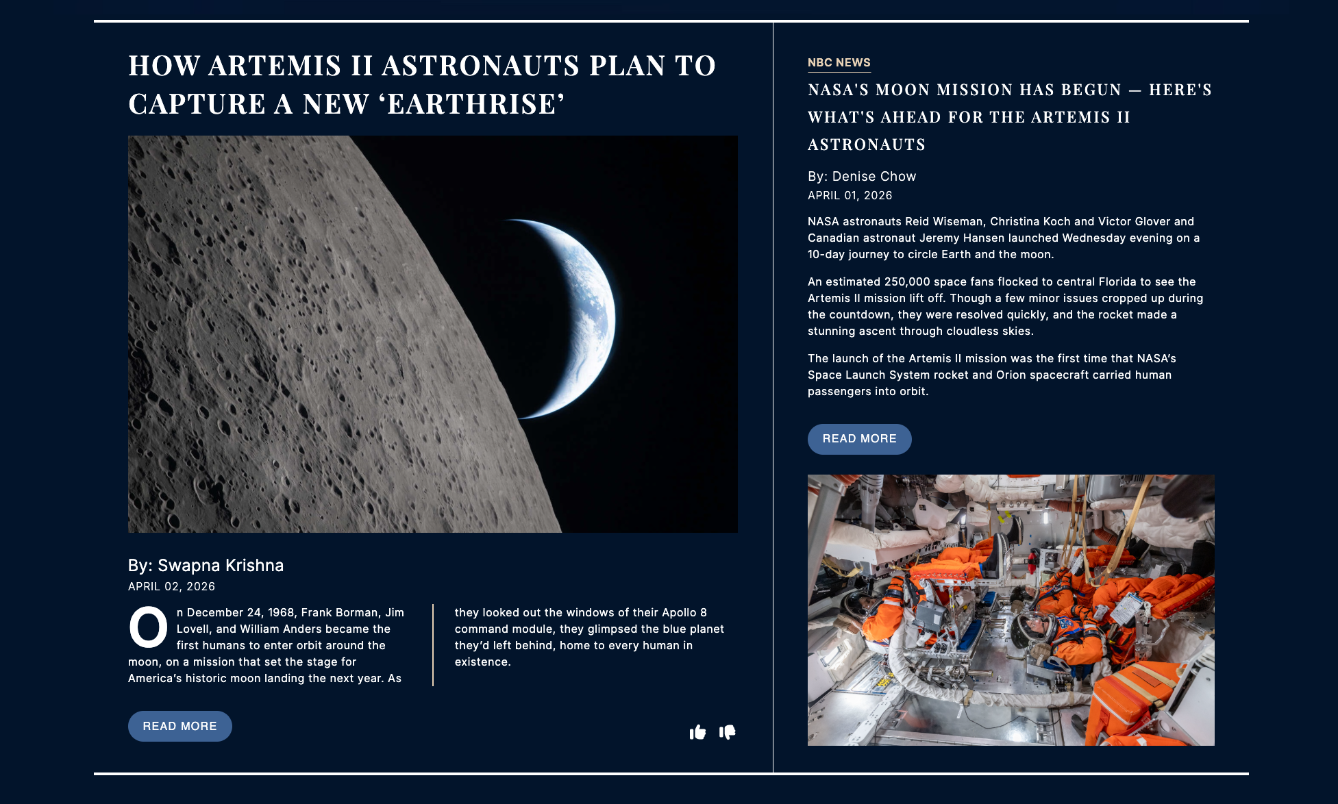
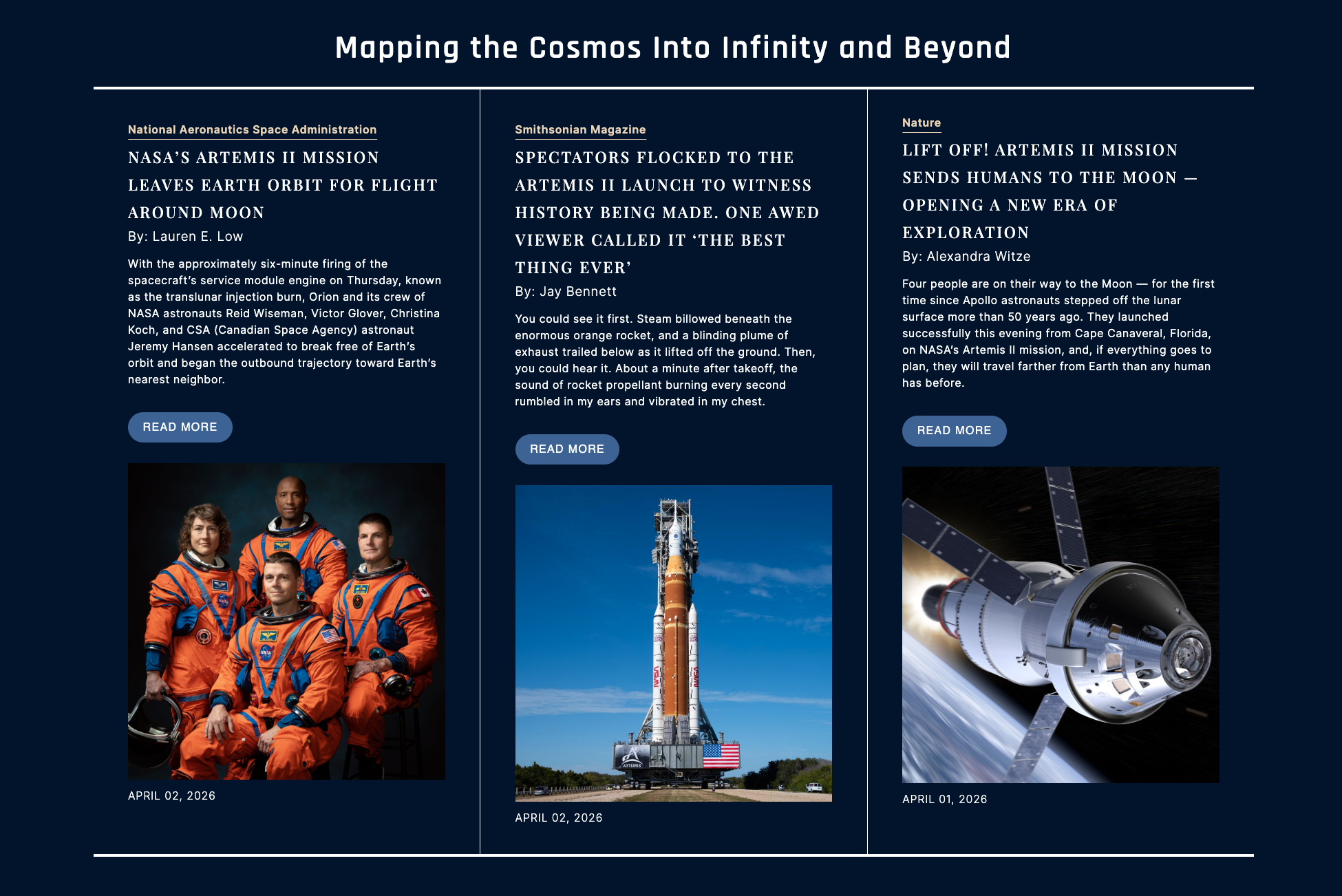
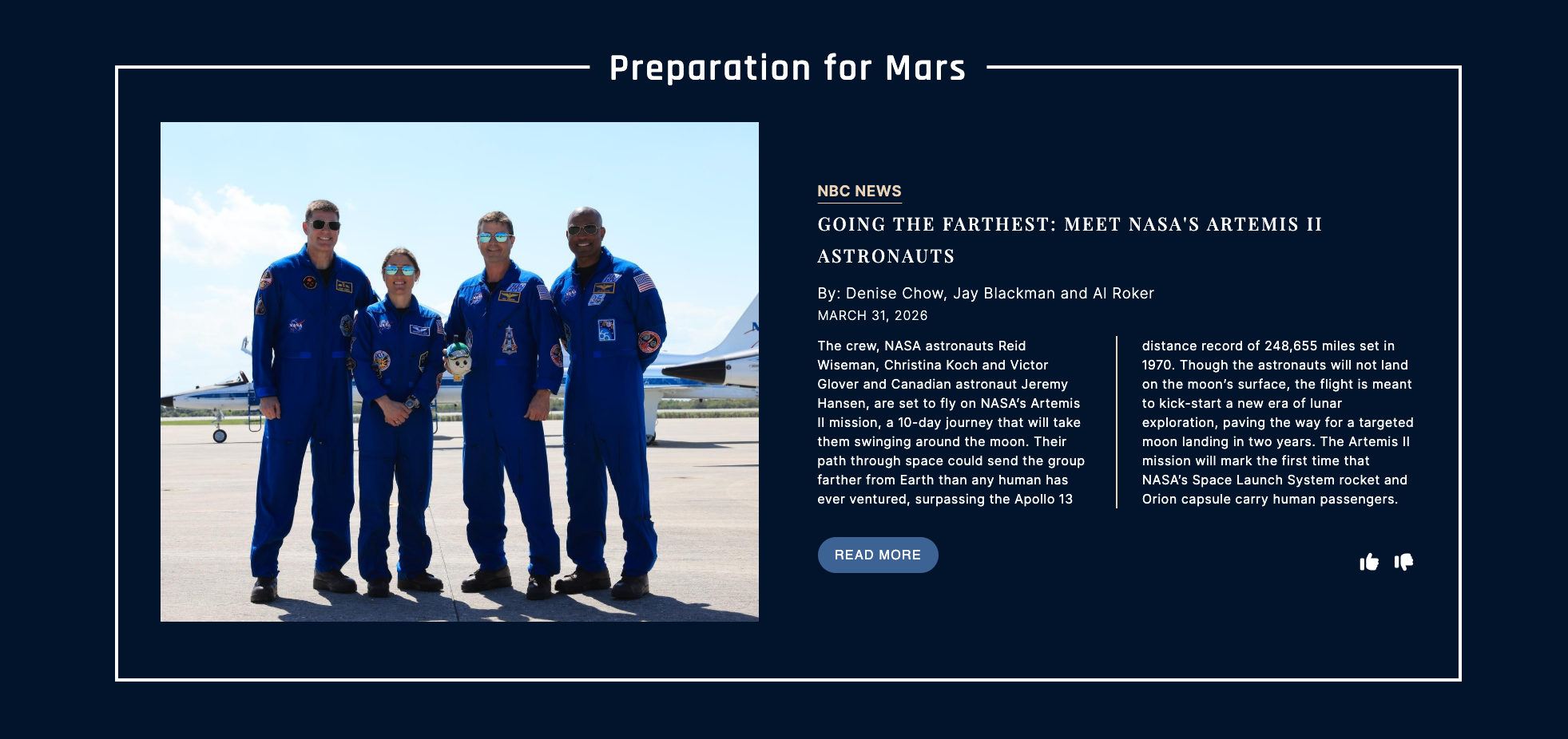
Selecting the articles and targeted users were essential to the design of the webpage. Choosing the images that went along with the articles ensures a smooth reading experience, and sketching various layouts helps visualize the result. The final design bridged the gap between a traditional newspaper webpage in addition to a social media platform making the webpage engaging for all browsers.
Credibility and knowing where the sources come from is incredibly important for older adults, and so ensuring the label of the sources was a priority. Having a branded logo and color palette establishes reliability and trust, which is also critical. High contrast typography and hierarchy helps the reader move through the page allowing for a smooth reading experience.
Concept & Strategy:
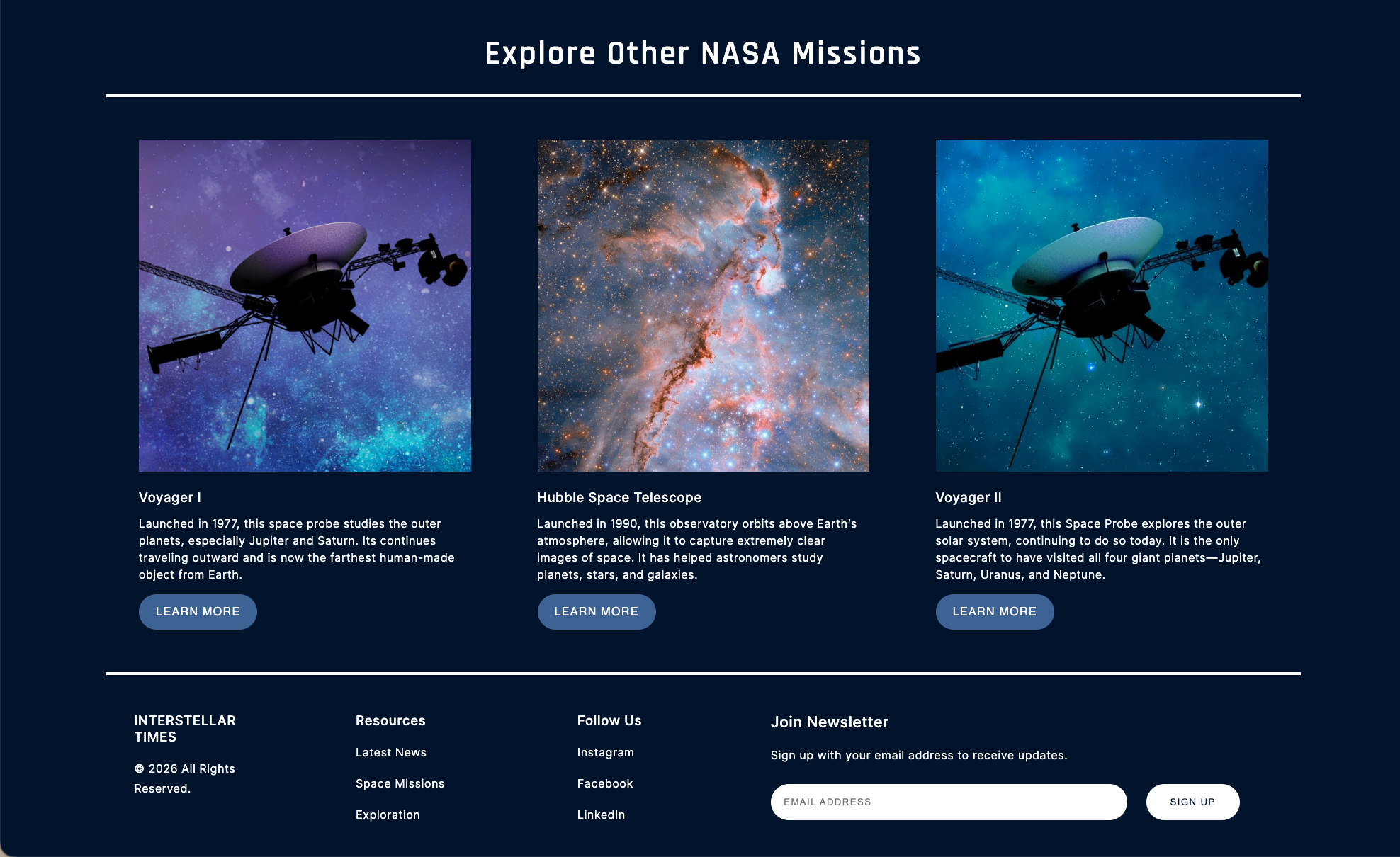
The curated newspaper feel with the division of columns and inclusion of related content help to give the webpage a traditional feel. Allowing users to subscribe to the newsletter also reinforces trust.
Many teens and young adults have limited attention spans so brief summaries and big images of all the content allows for a quick skim before committing to the full text. Interactive elements such as the like and share buttons mirror that of what one might find on social media which provides them with a familiar environment that encourages further exploration. Since this pool of users are likely to access the webpage via social media, ensuring that the page is responsive was also important. Providing resources and social media links in the footer helps direct them back to familiar environments.